Color harmony is an essential concept in home decoration, influencing the atmosphere and aesthetics of your living space. When done right, it can transform an ordinary room into a captivating and inviting environment that speaks volumes about your personal taste. Understanding the principles of color harmony can help you mix and match shades seamlessly, creating a balanced and stylish ambiance that reflects your individuality.
The Basics of Color Harmony
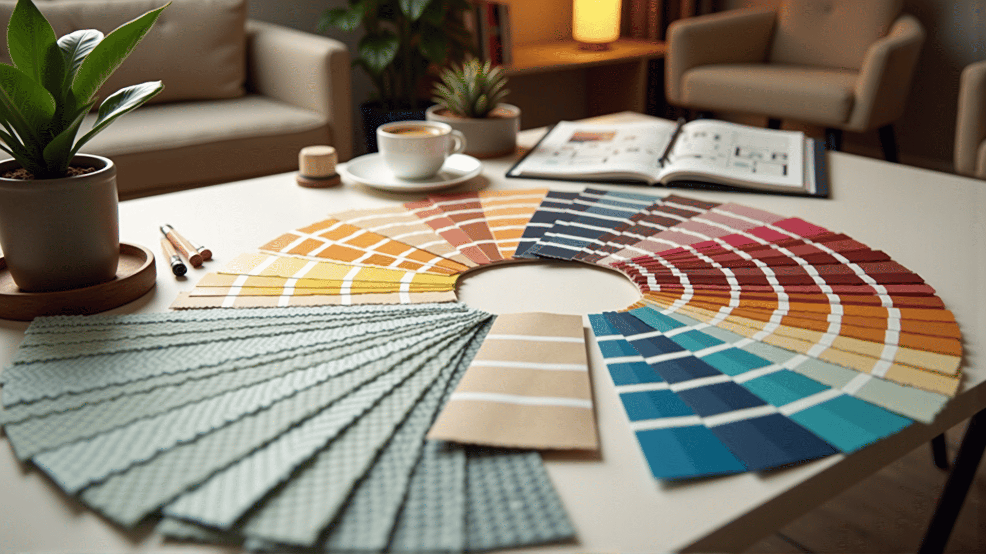
Color harmony refers to the pleasing arrangement of colors to create a cohesive and visually satisfying effect. By balancing hues, saturations, and values, you can enhance the ambiance of a space. Here's how you can achieve color harmony in your home:
-
The Color Wheel: Start with the color wheel, a tool that visually represents the relationships between colors. It's divided into three categories: primary (red, blue, yellow), secondary (green, orange, purple), and tertiary (mixes of primary and secondary colors).
-
Complementary Colors: These are colors directly opposite each other on the wheel. Using complementary colors can create vibrant looks, adding energy and movement to a space. However, they should be used thoughtfully to avoid overwhelming the senses.
-
Analogous Colors: These are located next to each other on the color wheel. Choosing analogous colors offers a more harmonious and serene look. This scheme is simple to create and naturally pleasing to the eye.
-
Triadic Colors: This involves using three colors that are evenly spaced around the color wheel. Triadic color schemes are notable for providing visual contrast while maintaining harmony. They are bold and offer a balanced yet dynamic aesthetic.
-
Monochromatic Colors: This scheme relies on variations in lightness and saturation of a single color. It is inherently harmonious but can be enhanced with textures and different material finishes to avoid monotony.
Implementing Color Harmony in Your Home
1. Choose a Base Color: Decide on a primary color that resonates with you and your space. This will act as the foundation upon which you'll build your palette. Consider the mood you want to evoke—calm and tranquil with blues and greens or warm and inviting with reds and oranges.
2. Create Balance with Neutrals: Incorporate neutral colors like whites, greys, or beiges to balance out bolder hues. These colors help ground your palette and prevent more vibrant hues from becoming overpowering.
3. Embrace Textures and Patterns: To add depth and interest to a room, integrate textures and patterns. Whether through fabrics, rugs, or wallpapers, varying textures complement your color scheme and enhance the room's tactile appeal.
4. Experiment with Accents: Use accent colors to give life to neutral spaces or to highlight particular areas or features. This could be in the form of decorative elements such as pillows, artwork, or vases that introduce pops of color without being intrusive.
5. Consider Lighting: Lighting plays a crucial role in how colors appear. Natural light can make colors look different at various times of the day. Be mindful of how artificial lighting will affect your chosen palette, opting for bulbs that enhance rather than distort your color scheme.
Personalizing Your Space
Ultimately, the key to successful color harmony in home decor is reflecting your personal style and preferences. Trust your instinct and let your surroundings reflect who you are. By following the principles of color harmony, you can create an inviting haven that feels uniquely yours, a place where you feel comfortable and inspired. In doing so, color becomes more than just a backdrop; it becomes a defining character of your home, echoing your style and aesthetic sensibilities.