Creating a perfect balance of colors in your home can profoundly transform the atmosphere and elevate the aesthetic appeal. The interplay of colors not only affects how a space looks but also influences how it feels. By mastering the principles of color harmony, you can craft interiors that are not only visually pleasing but also enhance the overall mood and ambiance.
Understanding Color Harmony
Color harmony refers to the aesthetically pleasing combination of colors that create a sense of balance and order. This concept is deeply rooted in the color wheel, an essential tool for artists and designers that organizes colors according to their chromatic relationships. Understanding basic color harmony can guide you in selecting hues that resonate well together.
Types of Color Harmonies
-
Complementary Colors: These are colors located opposite each other on the color wheel. Using complementary colors can bring a vibrant contrast to a room, creating an energetic and lively environment. For example, pairing blue with orange can invigorate your space with intensity and intrigue.
-
Analogous Colors: These are colors that sit next to each other on the color wheel. They usually match well and create serene and comfortable designs. An example of an analogous harmony would be the use of greens and yellows, which can provide a calming and cohesive feel.
-
Triadic Colors: This harmony involves using three colors that are evenly spaced around the color wheel. Triadic color schemes tend to be quite vibrant, even if you use pale or unsaturated versions of the hues. A balanced triadic scheme, like red, yellow, and blue, can bring a playful and dynamic element to your room.
-
Monochromatic Colors: By focusing on variations of a single hue, you can create a minimalist and subtle ambiance. This approach emphasizes the different shades and tints of a color, providing a sophisticated and calming effect.
Applying Color Harmony in Interiors
To successfully integrate these principles into your space, consider the mood you wish to convey. Warm colors such as reds and yellows can make a room feel lively and inviting, while cooler colors like blues and greens usually evoke calmness and tranquility.
-
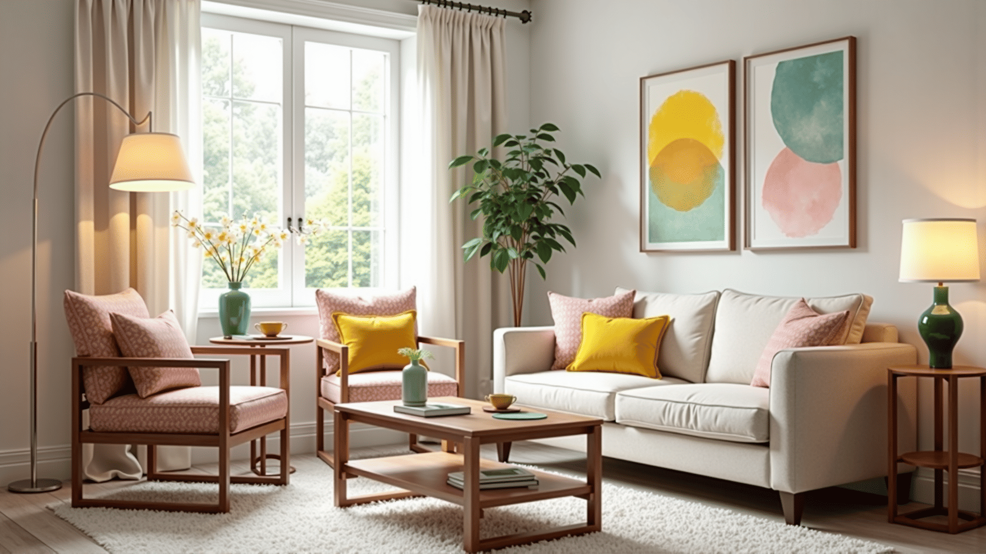
Living Room: Opt for a complementary color scheme to stimulate conversation and energy. Balancing a warm color with its opposite can make for a vibrant social environment.
-
Bedroom: Monochromatic or analogous color schemes may be more suited to this space, promoting relaxation and rest. Stick to cooler tones for a restful night's sleep or warmer tones for a cozy ambiance.
-
Kitchen: Triadic color schemes can add a splash of fun and creativity to this central hub of activity. Vibrant color pops can also increase appetite and enjoyment.
Tips for Successful Color Implementation
-
Balance Intensities: Use bold colors sparingly if you want to maintain a calming environment. Let soft, neutral backgrounds support these splashes of vibrant hues.
-
Mind the Proportions: Follow the 60-30-10 rule, using 60% of a dominant color, 30% of a secondary color, and 10% for an accent color to maintain a balanced look.
-
Consider Light: Lighting can significantly alter the perception of color. Observe how natural and artificial lights in your space interact with chosen colors, ensuring they maintain the desired effect throughout the day.
By understanding and applying the principles of color harmony, you can curate an atmosphere that not only pleases the eye but also nurtures the soul. Unleash the transformative power of color and watch as your interiors come to life with newfound energy and mood.